/ MOTION GRAPHICS & INTERACTIVE DESIGN
Translated Sounds
TRANSLATED SOUNDS译声 is an ongoing experimental project that focuses on how onomatopoeia differs in English and Mandarin Chinese and presenting them in a visual and dynamic way using typography and motion graphics.
Website Landing Page
My Role
Visual Designer, Interactive Designer
Deliverables
Motion Pieces
Website
Interactive Element
Duration
~2 month
Inspirations & Early Projects
This was a project that I created during my semester study abroad in Japan. This was originally a lithograph print piece that serves to compare chinese/japanese characters with enligsh characters.

Quotation marks in Japanese vs Western languages

Letter "O" and Chinese charater 口 (mouth)
This was an experimental project that I create a while ago to try and sharpen my motion graphic skills by taking a random work and trying to visualise them in a motion poster form.

Motion Poster, Rotate

Motion Poster, Material
Motion Graphics
RESEARCH & PLANNING
Onomatopoeias are words that mimic the actual sounds in our life. I first became interested in onomatopeias during my study abroad in Japan, when one of my assignments was to learn about Japanese onomatopoeias. I was amused by the range and ideas these words could portray and the difference in languages even when mimicking the same sounds.

Brainstorm

Possible visualisations of each word
EXPERIMENTATION
I want to start experimenting with as many ways I could with how I could visualize sound and this is the first experiment I made to try and figure out how I want to visualise these onomatopoeias. This one was created by mapping the amplitude of the Chinese onomatopoeia for woof, “汪(wang)” with the outline of the character.
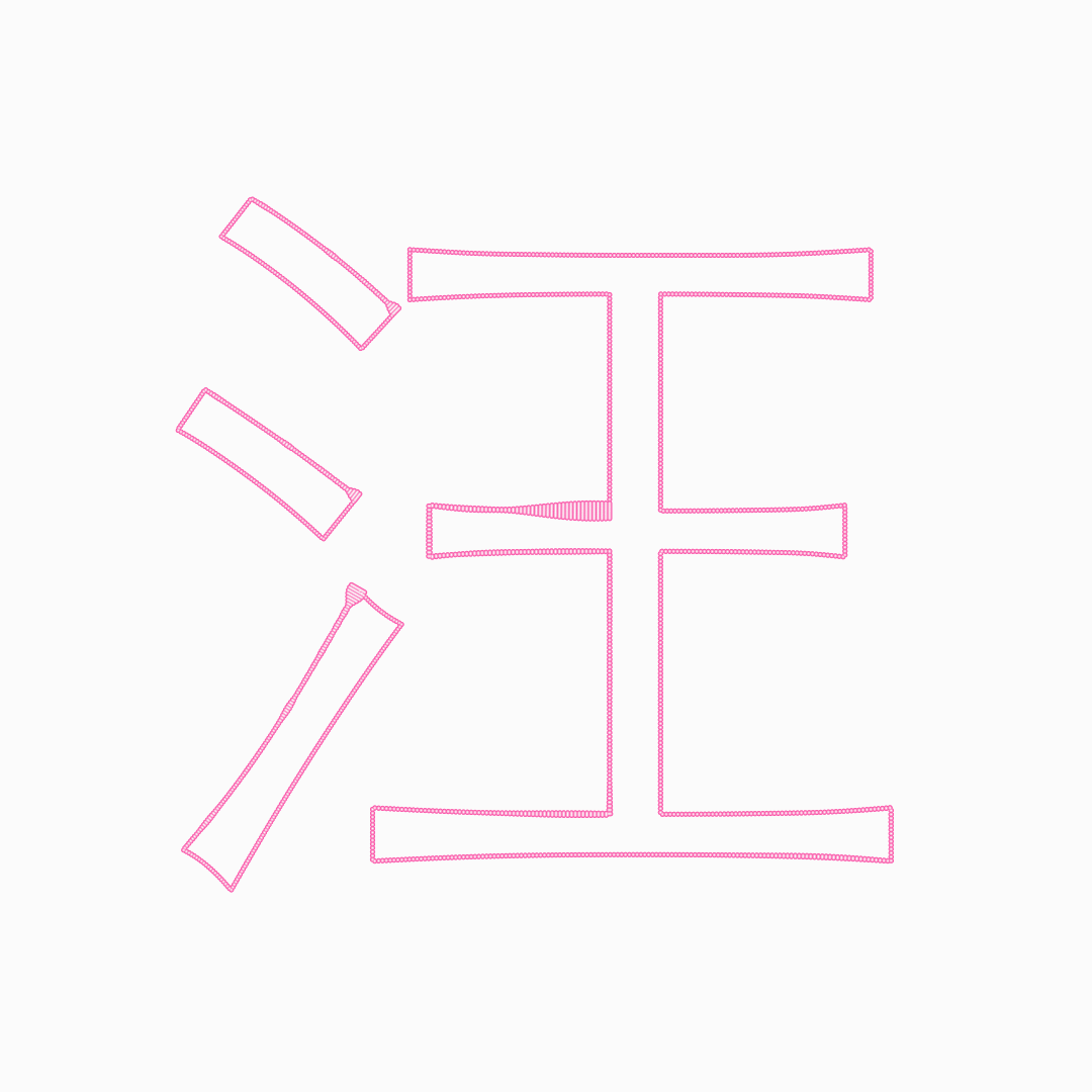
汪 mapped to the amplitude of its pronunciation
This is another experiment I created in both English and Chinese trying to visualise what the onomatopoeia means and represents. I enjoy this style a lot more as I thought it was a lot more flexible than the previous experiment. I also decided that I was going to make the appearance of the English and Chinese characters/font in a similar style. Much of this project was purely experimental, but a lot also replies on planning and setting certain parameters to make sure there is still some consistency throughout the individual motion pieces.

Ding Dong/叮咚 Initial Designs
TYPEPACE
Going into a few more motion pieces, I’ve decided to create a font for the English characters to make my workflow faster. I created a few rules of how the font is going to look and make it into a monospaced all-caps font to easily control the length of the words as well as lining up with the Chinese versions.

English typeface

Creating font with Fontforge
I kept the height of the characters the same height, but the length of the Chinese characters are slightly wider than the English characters because the word count in Chinese words is usually a lot shorter than English.


Dong
咚
MOTION ONOMATOPOEIAS EXAMPLES
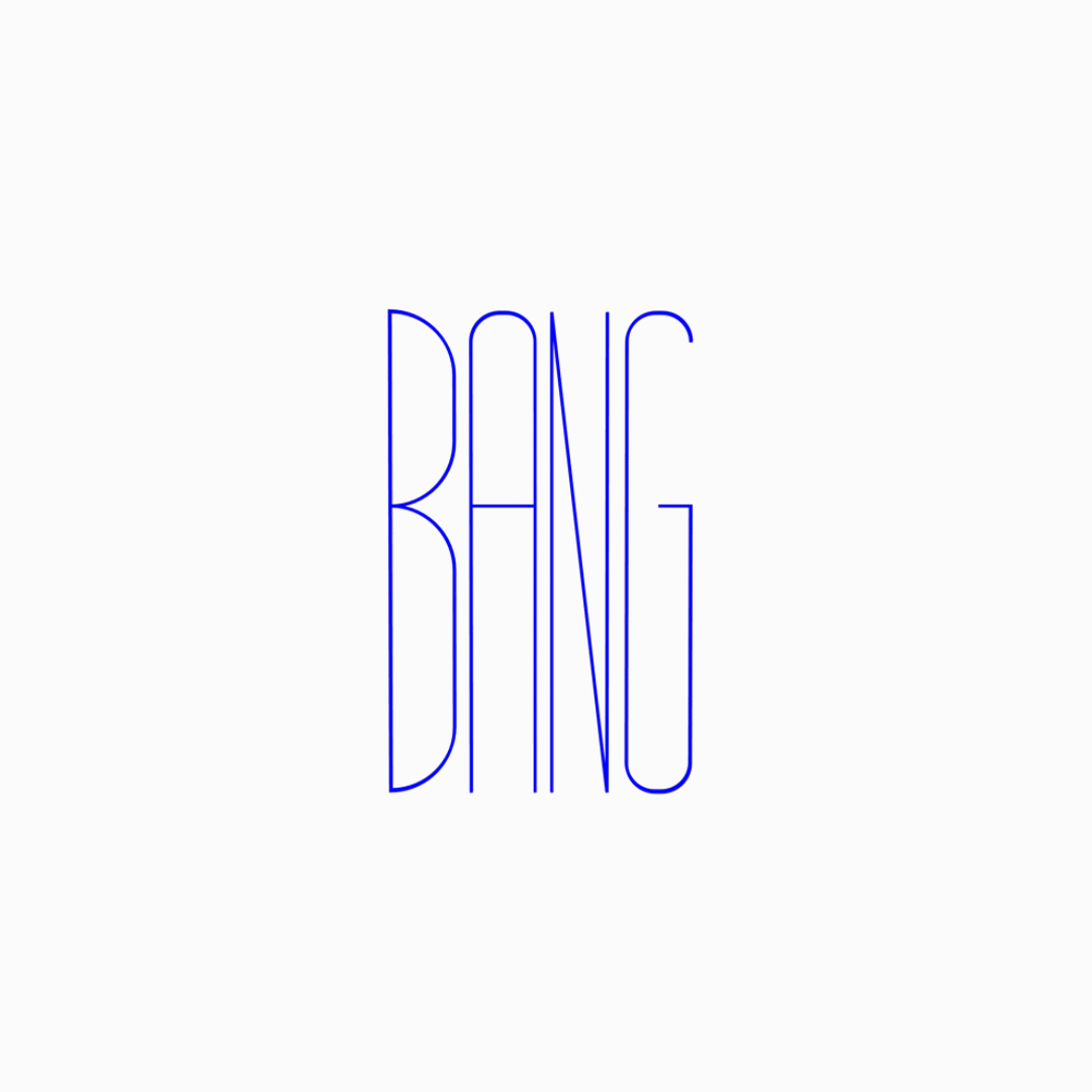
Bang

Shatter

嘣
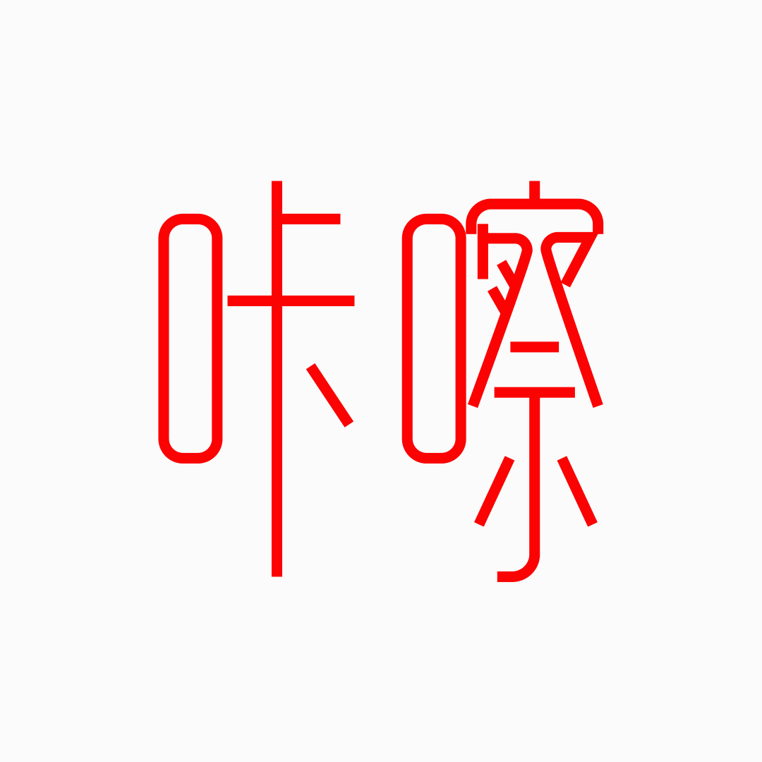
咔嚓
Website
WIREFRAME
I planned to keep the layout of the website as simple as possible to create more emphasis on the motion graphic pieces.

Lo-fi Wireframe
CARD UI DESIGN
I tried to figure out which was the best way to present these individual pieces combining both English and Chinese versions, but still not making the layout too overwhelming. These are a few layouts that allow the users to toggle between the English and Chinese versions of each word.

UI Design Options
COMBINING LANGUAGES
After testing out a few layout options, I’ve decided to combine the English and Chinese pages onto the same page, as one of my initial goals was to create a piece that could present a bilingual design.

Seperated Layout

Combined Layout
ARCHIVE PAGE
For the final archive page design, I’ve decided to create a language category filter so users could toggle between the English and Chinese pieces as a whole. The individual pages showcase both languages on the same page with definitions and pronunciations of each word to imitate the function of a dictionary.

Filter unselected

English filter selected

Individual onomatopeia page layout
FINAL WEBSITE
Interactive landing page
